ADI Brand Refresh
This brand guide outlines the core elements of the ADI visual identity. It establishes clear direction for logo use, color, typography, shapes, and icons, creating a consistent and modern brand across all touchpoints.
The system brings unity to digital, print, product, and environmental applications while allowing room for creative expression within a cohesive framework.
Project Overview
I led the visual identity refinement for ADI following the ADI × Snap One merger. Rather than a full rebrand, the goal was to unify existing assets into a scalable system that works across product, marketing, and digital platforms.
Role: Art Director & Brand System Lead
Collaborated with the creative director, designers, copywriters, and photographers to deliver the brand book, design system, icon library, and marketing templates.
Year
2025
Scope
Branding, Design system

Company Snapshot
ADI Global Distribution is a worldwide leader in security, AV, and smart-home technology. Following the Snap One merger, a modernized and cohesive design system was needed to align visual, verbal, and digital touchpoints under one scalable standard.
Logo System
The refreshed logo system defines precise usage, spacing, and optical alignment. The “A” form informed many structural choices across the brand — from shape system geometry to icon corner radius. Consistent application across digital, print, and apparel builds trust and recognition.

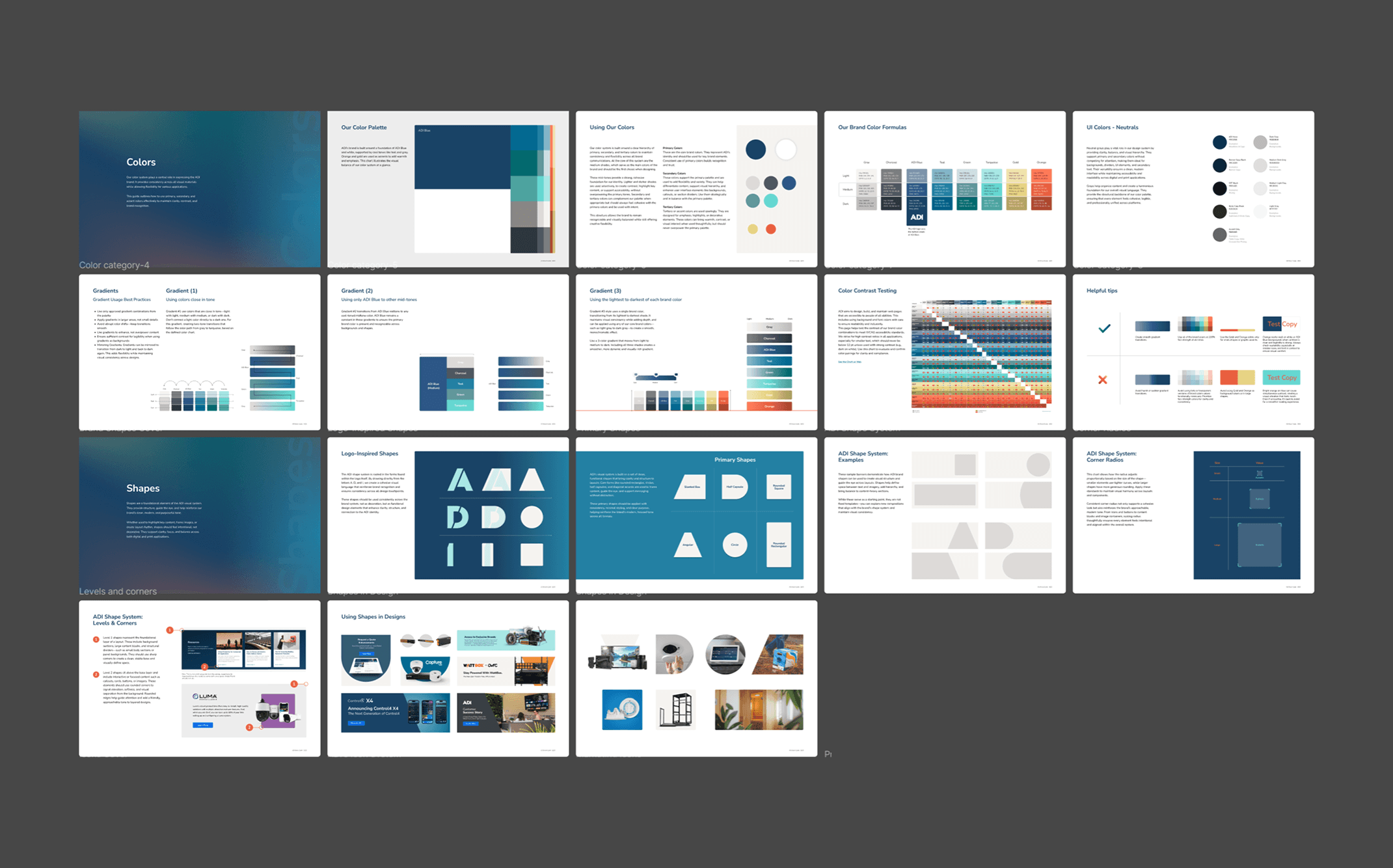
Color System
Our color system balances consistency and flexibility. ADI Blue and white anchor the palette, supported by cool tones and warm accents. Primary colors build recognition, while secondary and tertiary tones add contrast and structure. Grays create clarity. Gradients add depth when used with care. Each shade plays a role in maintaining a modern, accessible, and unified brand presence.

Shape System
Our shape system is directly inspired by the ADI logo. Key forms like rounded rectangles, diagonals, and half-capsules are drawn from the A, D, and I letterforms. These shapes create structure, guide the eye, and bring rhythm to layouts. Applied with consistency and purpose, they strengthen brand recognition and visual clarity across all formats.

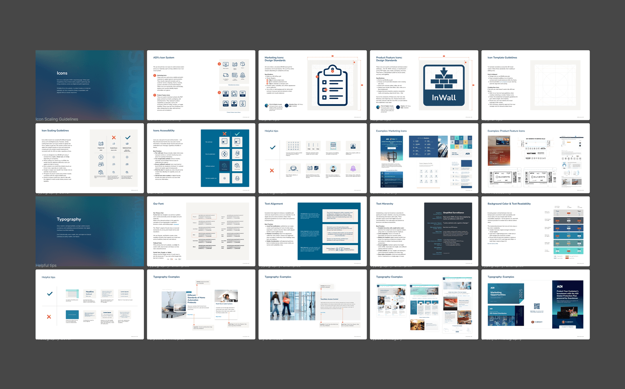
Icon System
Icons support clarity and cohesion across platforms. Built on an 80×80 grid, they follow consistent stroke weights and visual rules. Marketing icons are clean and friendly. Product icons are precise and functional. Each icon should feel simple, recognizable, and aligned with the ADI brand.