ADI’s Brand Guide Refresh
A cohesive identity built for consistency, clarity, and scale.
Project Overview
Over the past months, I led the redesign of ADI’s visual identity following the ADI × Snap One merger. Instead of a total reboot, I led a strategic refinement; bringing cohesion across logos, colors, typography, icons and UI, so the brand could scale effortlessly across product, marketing and digital channels.
Role: Art Director & Brand System Lead
Partnered with the creative director, digital designers, copywriters, and photographers to deliver the brand book, design system, icon library and marketing templates.
Company Snapshot
ADI Global Distribution
ADI Global Distribution is a worldwide leader in security, AV, and smart-home technology. Following the Snap One merger, a modernized and cohesive design system was needed to align visual, verbal, and digital touchpoints under one scalable standard.
$4.2B+
in net sales (2024)
200+
locations in 20+ countries
110,000+
customers served worldwide
12M+ units
in inventory and 62M+ distributed per year
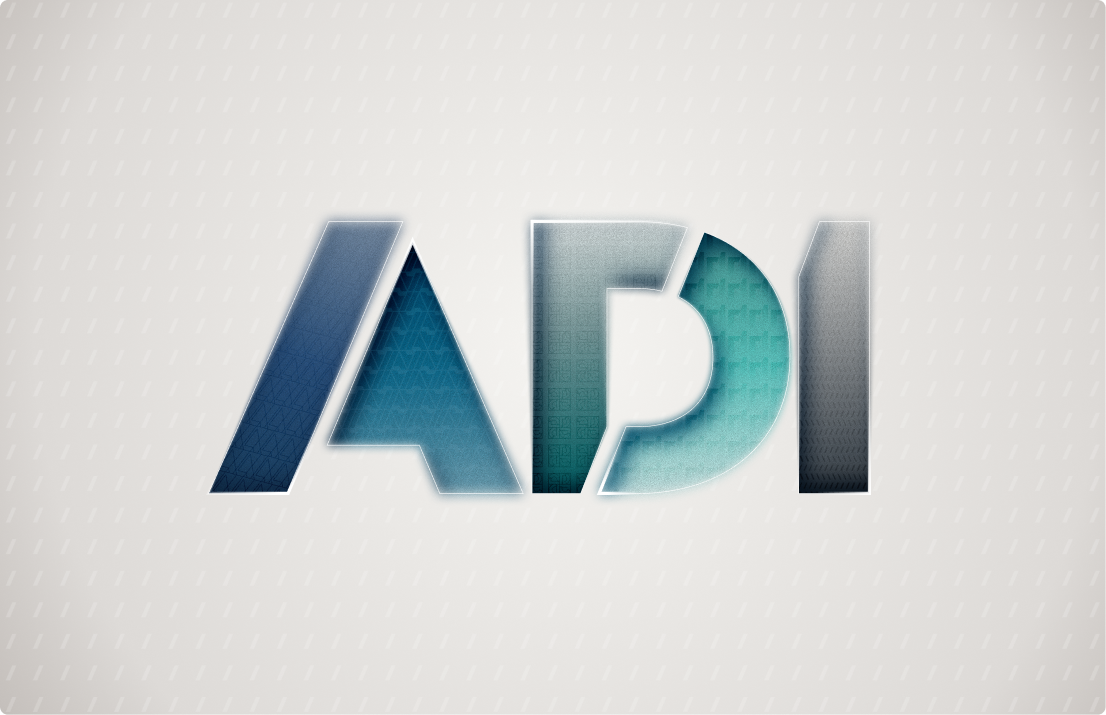
Logo System
The refreshed logo system defines precise usage, spacing, and optical alignment. The “A” form informed many structural choices across the brand — from shape system geometry to icon corner radius. Consistent application across digital, print, and apparel builds trust and recognition.